Introduction
Did you know that telemedicine usage surged 38x since the pandemic? That's a mind-boggling shift in how healthcare gets delivered, with the global telemedicine market now worth a whopping $91.53 billion in 2024. This rapid growth has significantly impacted service delivery in healthcare, transforming the traditional patient journey into a digital experience.
But here's the problem: despite this massive growth, 30% of patients hit the back button and abandon telehealth platforms because they're just too difficult to use. Doctors aren't happy either, many report that poorly designed Electronic Health Records contribute to medical errors. Not exactly what you want to hear about systems handling your health data. This highlights the critical need for effective patient journey mapping in telehealth design to ensure both usability and patient satisfaction.
The healthcare industry is trying to catch up, growing at 10.40% annually, but it's still dragging its feet compared to other sectors when it comes to adopting new technologies. This is where thoughtful telehealth UX design becomes crucial, it reduces errors, improves safety, and helps bring medical services to people who might otherwise struggle to access them. By focusing on creating a seamless patient journey in healthcare, we can significantly enhance service delivery and overall healthcare accessibility.
Sidenote:
About 1 in 4 Americans has some type of disability, yet many healthcare apps completely fail to meet basic accessibility guidelines. That's a lot of people potentially shut out from digital healthcare, emphasizing the need for inclusive patient journey mapping.
In this guide, I'm going to walk you through five straightforward steps to create effective medical UX for telehealth applications. Nothing overly complex or theoretical, just practical advice to help you design interfaces that work for both patients and the healthcare providers who use them. These steps address the unique challenges that come with delivering healthcare through screens rather than in person, focusing on optimizing the patient journey and enhancing service delivery.
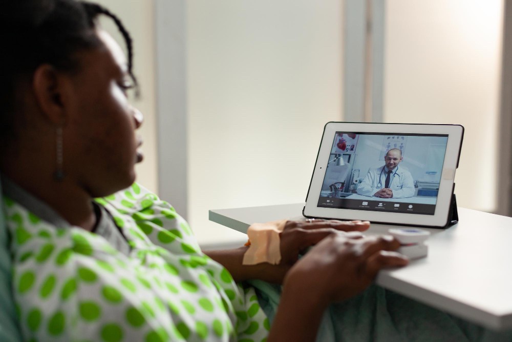
Step 1: Understand the Telehealth Context
Successful telehealth isn't just slapping an in-person appointment onto a video call. It requires reimagining the entire care experience with the unique context of virtual healthcare in mind. This is where patient journey mapping becomes invaluable, helping us visualize and optimize each step of the telehealth experience.
Think about this:
Patients are in their homes, providers are in their offices, and there's a screen between them. This changes everything about how care is delivered and necessitates a thorough understanding of the patient journey in healthcare.
Identify user types and their needs
Before designing anything, you need to know who's actually using your telehealth platform. While this might seem obvious, it's surprising how many telehealth platforms are built without considering all the different types of people who'll be clicking those buttons. This is where patient journey mapping comes into play, helping us identify and address the needs of various user groups.
Patient User Types:
Patients aren't one-size-fits-all, and your telehealth UX shouldn't be either. Here are the main groups you'll need to design for, each requiring a unique approach in your patient journey mapping:
Emergent patients: Most emergency cases head straight to the ER, but some telehealth solutions help hospital staff provide rapid care to these patients.
Non-emergent patients: These folks need attention within 24 hours but aren't facing emergencies. They might be in pain, tired, or irritated all factors that affect how they interact with your interface.
Chronic or specialist care patients: These patients typically seek specific providers and have ongoing conditions that need regular monitoring.
Elderly patients: This group often struggles with new tech and may have vision, hearing, or memory challenges that make navigating telehealth platforms difficult.
Patients with disabilities: Approximately 1 billion people globally live with disabilities, making accessibility non-negotiable in telehealth design.
Patient personas help bring these abstract groups to life. Through interviews and surveys, you can develop realistic representations of your users with concrete goals and challenges. For instance, "Margaret, 72, with type 2 diabetes and mild cataracts" will have very different needs than "Jason, 28, tech-savvy with occasional sinusitis." These personas form the foundation of your patient journey mapping process.
Provider User Types:
Don't forget that healthcare providers are users too! And they have their own set of challenges:
Doctors, nurses, and other medical professionals are often juggling busy workflows with patient demands in virtual settings. They need quick access to patient info, efficient documentation tools, and seamless integration with existing systems. Plus, they're dealing with tight schedules and the pressure to avoid errors. Understanding their journey is crucial for optimizing service delivery in telehealth.
The best way to understand their needs is to watch them work. Contextual inquiry; observing providers using systems in their actual environments; reveals insights you'd never get from a conference room discussion. Simple questions like "What's the most frustrating part of your day?" or "If you could change one thing about this process, what would it be?" can guide you toward creating interfaces providers will actually want to use.
Before implementing anything, conduct a thorough needs assessment with all user groups. Talk to them about their skills and expectations. This prevents the common mistake of assuming users will adapt to whatever system you implement. This step is crucial in creating an accurate and comprehensive patient journey mapping template.
Analyze clinical workflows and constraints
Medical UX design for telehealth has to work with the specific workflows that healthcare professionals follow. Going from in-person to virtual care means overhauling several processes, including scheduling, billing, check-in procedures, appointment structure, triage protocols, consent gathering, and documentation. This transition requires a deep understanding of the patient journey in healthcare and how it translates to a digital environment.
Understanding Clinical Workflows:
Before launching telehealth services, consider these workflow factors, which will inform your patient journey mapping:
Staffing requirements - Will you need new roles, like a telehealth coordinator or IT lead? How will existing staff roles change?
Technical capabilities - How comfortable are your staff with technology? What training will they need?
Patient accommodation - How will your system handle patients needing special accommodations, language support, or those with disabilities?
Provider organization - Research shows dedicated telehealth blocks work better than mixing virtual and in-person appointments. If that's not possible, schedule virtual visits at the beginning of clinic blocks.
Technical support systems - You need a plan for helping patients with tech issues before appointments. This might be medical assistants calling patients beforehand or automated flows guiding patients through setup.
Pro tip: Don't forget about the people who might be helping patients during telehealth visits, caregivers, translators, family members. They're part of the workflow too and should be considered in your patient journey mapping.
Technical and Regulatory Constraints:
Telehealth isn't the wild west, it's highly regulated. Your design needs to navigate these constraints:
HIPAA ensuring patient data confidentiality
GDPR controlling how user data is stored and shared
FDA Regulations governing medical software
WCAG ensuring accessibility for patients with disabilities
Finding the sweet spot between compliance and usability is a real challenge. A telehealth platform with complex multi-step logins might tick all the security boxes but will frustrate elderly patients or those with disabilities. That's a trade-off you need to carefully consider when mapping the patient journey.
Platform selection considerations:
Your choice of telehealth platform will dramatically impact workflow integration and the overall patient journey. Consider:
Practice size and setting - Larger practices often need standardized platforms across the group, while smaller practices might do better with more personalized approaches.
Integration capabilities - Your healthcare UX should enable seamless integration with Electronic Health Records, letting doctors access and update patient records without jumping between systems.
Demographic considerations - Your platform should accommodate your specific patient population's needs, including their tech skills and accessibility requirements.
For practices with trainees involved in ambulatory encounters, an EMR-integrated multi-provider virtual platform lets supervision happen within the platform in real time. You'll also want to optimize for low-bandwidth connections with features like auto-adjusting video quality and asynchronous messaging options.
Understanding both user types and clinical workflows isn't just a box to check, it's the foundation for creating a telehealth experience that works in the real world, not just in the ideal conditions of a design studio. This understanding forms the basis of effective patient journey mapping and helps create a learning health system that continuously improves based on real-world data and feedback.
Step 2: Conduct Research and Define Requirements
Once you've mapped out the telehealth context, it's time to roll up your sleeves and get some real data. Good research isn't optional here, it's the bedrock of effective medical UX design. Without it, you're basically designing in the dark. This research phase is crucial for creating accurate patient journey maps and understanding the nuances of service delivery in telehealth.
Run user interviews and surveys
For healthcare apps, user research is even more important than in other fields. Medical UX research gives you critical insights into what users actually need, not just what we think they need. This approach helps validate your concepts before you sink time and money into development, reducing the risk of building something nobody wants to use. It's an essential step in creating a learning health system that evolves based on user needs and experiences.
Conducting effective user interviews:
User interviews are gold mines of qualitative data. They involve one-on-one conversations with participants to dig deep into their thoughts about your telehealth platform. These conversations help build empathy and understanding of real user experiences, which is crucial for accurate patient journey mapping.
When planning interviews, I always start by figuring out exactly what I want to learn. Vague goals like "understanding users better" usually lead to useless results. Instead, I focus on specific questions:
What motivates people to try our telehealth product?
What do users love or hate about their experience?
Why do people abandon our platform?
Next, I create an interview guide with open-ended questions that encourage people to share their stories:
"Walk me through a typical telehealth appointment for you."
"Tell me about the last time you used a telehealth service."
"Describe a time when you had difficulty using a telehealth platform."
Pro tip: Always follow up with probing questions to get to the heart of the matter:
"How did that make you feel?"
"What would have made that easier for you?"
"Why was that important to you?"
For telehealth platforms, you need to interview both sides of the equation—patients and healthcare providers. Doctors and nurses can tell you about workflow issues and system effectiveness that patients simply won't see. This dual perspective helps create designs that work for everyone involved and contributes to a more comprehensive patient journey mapping process.
Implementing surveys effectively:
While interviews give you depth, surveys give you breadth. They help you measure attitudes across a larger group and collect structured data about specific issues, which is invaluable for patient journey analytics.
When creating surveys for telehealth research, I make sure they:
Stay short (10 questions or fewer will get you more completed responses)
Use clear, straightforward questions
Don't lead respondents toward particular answers
Include different question types for well-rounded data
Sidenote. Surveys are particularly handy for validating patterns you spotted in interviews. In healthcare, they're great for measuring patient satisfaction with telehealth services or gathering feedback from busy providers who might not have time for interviews.
The research process typically follows this path:
Planning: Figuring out what you need to learn and how
User recruitment: Finding the right people to study
Data collection: Conducting interviews and surveys
Analytics and testing: Examining how users interact with your platform
Data analysis: Spotting patterns and key insights
Insights reporting: Summarizing what you learned
Implementation: Using those insights to drive design decisions and refine your patient journey mapping
Map patient and provider journeys
Journey mapping gives you a visual representation of the entire user experience. It shows where things stand today and where you want to head tomorrow. This visual approach helps team members quickly grasp complex information without wading through mountains of text. Patient journey mapping is particularly crucial in telehealth, where the traditional healthcare experience is transformed into a digital one.
Creating effective patient journey maps:
Patient journey mapping breaks the healthcare experience into clear stages. A typical patient journey includes:
Awareness stage: When symptoms prompt a patient to seek care
Initial contact: Reaching out to schedule an appointment
Care delivery: The actual telehealth appointment
Treatment: Receiving care recommendations or prescriptions
Recovery or maintenance: Ongoing interaction with providers
Post-treatment care: Follow-up and preventative care
To build useful journey maps, I start by identifying key personas. Research shows telehealth users fall into about six distinct categories based on how they enter the system. Each journey map should match a specific persona, with most businesses creating three to five personas to start.
Next, I gather both quantitative and qualitative data about patient experiences. This means analyzing patient records, studying feedback, reviewing analytics, and looking at market research. This comprehensive approach contributes to creating a learning health system that continuously improves based on real-world data.
Talking to healthcare staff, from doctors to receptionists, provides additional perspectives on the patient journey and reveals pain points you might otherwise miss. During these conversations, I focus on exceptions and process volumes to find inefficiencies that affect patient experience and overall service delivery.
Mapping provider journeys:
Don't forget about the healthcare professionals! They face unique challenges in telehealth environments, often juggling busy workflows while dealing with patient needs. Their journey maps should cover:
Operational workflows that change when switching to telehealth
Staffing requirements and possible new roles
Technical capabilities and training needs
Patient accommodation processes
Schedule organization and appointment blocking
Journey maps highlight decision points where users might abandon the process. There's often an assumption in healthcare that patients will stick with treatment no matter what, but journey maps show that users actually make choices at each stage, affecting both patient satisfaction and overall service delivery.
Good journey mapping identifies friction points. In telehealth, these typically include:
Medical jargon that confuses patients
Navigation mazes that prevent users from completing tasks quickly
Poor search functionality that makes finding information difficult
Notification systems that fail to properly alert users about appointments
By mapping these journeys, I can design telehealth interfaces that solve these problems with plain language, intuitive navigation with minimal clicks, better search tools, and clear notification systems. This approach helps create a more user-friendly telehealth experience and contributes to improved patient satisfaction.
The best journey maps combine hard data with qualitative insights for a complete picture of user behavior. This approach lets me connect pain points to processes and prioritize improvements. This is a crucial part since research shows 70% of users abandon an app after just one frustrating experience. By continuously refining these journey maps based on user feedback and data, we create a learning health system that evolves to meet user needs more effectively.
Step 3: Design the Core User Flows
Now that you've done your research and created comprehensive patient journey maps, it's time to transform those insights into something tangible. This step is where we bridge the gap between understanding users and creating an interface that actually works for them, optimizing service delivery in the process.
Create wireframes for key interactions
Think of wireframes as the skeleton of your telehealth app. They show the structure and layout before you invest time in final designs. For medical UX, these wireframes guide everyone involved by mapping out how users will interact with your app. They're a crucial step in translating your patient journey mapping insights into a tangible design.
I always start with low-fidelity wireframes of the basic structure. Nothing fancy, just simple illustrations showing screens and functionality. The beauty of this approach is that patients and doctors can provide feedback early without feeling like they're criticizing finished work. This iterative process contributes to creating a learning health system where design evolves based on continuous feedback.
After gathering that initial feedback, I move to medium or high-fidelity wireframes that include:
Basic branding elements
Color schemes and styling
Content placement
Feature definitions
Several tools work particularly well for telehealth wireframing:
Sketch
InVision
Figma
Pro tip: Use collaborative wireframing sessions with actual healthcare professionals. I've found they identify usability issues I would have missed, which leads to more user-friendly designs. This approach helps spot pain points in the user journey before development begins, saving time and resources and ultimately improving service delivery.
Don't forget to create separate mock-ups for websites and mobile devices. This sounds obvious, but you'd be surprised how many designers create a beautiful desktop experience only to have it fall apart on mobile, where, remember, most of your users will probably be accessing the platform. Ensuring a consistent experience across devices is crucial for maintaining patient satisfaction and optimizing service delivery.
Design for accessibility and inclusivity
Accessibility isn't just a nice-to-have for telehealth, it's essential. About 1 in 5 people has a disability that might affect how they use digital health tools, so your telehealth interface needs to accommodate users with different abilities. This focus on accessibility is a key component of comprehensive patient journey mapping and contributes to improved healthcare accessibility overall.
When I'm designing for accessibility, I focus on three main areas:
Visual accessibility
High-contrast text and elements (no light gray text on slightly lighter gray backgrounds!)
Adjustable font sizes
Color palettes that work for colorblind users
Designs that work for both right and left-handed users
Functional accessibility
Screen reader compatibility (this is often overlooked)
Voice control options
Alt text for all images
Multiple language support
Keyboard navigation support
Cognitive accessibility
Clean, simple layouts
Reduced cognitive load
Intuitive navigation
Clear instructions
The best telehealth UX embraces simplicity. I've seen too many interfaces that try to cram every possible feature onto one screen. Instead, focus on essential content and functionality with clean layouts. This approach helps everyone, but especially users with cognitive disabilities or visual impairments. It also contributes to improved patient satisfaction by making the telehealth experience less overwhelming.
High contrast is another must-have. It helps users with low vision or color vision deficiencies actually see what's on screen. Many platforms now offer customizable interface settings so users can adjust visual elements to their needs. This level of personalization is a key aspect of creating an inclusive patient journey in healthcare.
Remember to test with diverse user groups. Your accessibility efforts should go beyond technical compliance to create genuinely inclusive experiences where everyone feels valued. This approach not only improves healthcare accessibility but also contributes to overall patient satisfaction and more effective service delivery.
Ensure HIPAA-compliant UX patterns
The tricky part of telehealth UX design is balancing usability with security. Since these platforms handle sensitive patient data, ensuring HIPAA compliance isn't optional. This compliance is a crucial aspect of the patient journey in healthcare, as it builds trust and ensures the protection of sensitive information.
Here are the essential HIPAA-compliant patterns I build into telehealth interfaces:
User Authentication & Access Control
Multi-factor authentication (verifies user identities)
Role-based access control (restricts who sees what)
Unique user IDs (tracks who's accessing information)
Automatic session expiration (prevents unauthorized access)
Data Protection Measures
End-to-end encryption for all communication
AES-256 encryption for stored data
TLS 1.2+ encryption for transmitted data
Secure servers with protective measures
Privacy-Enhancing Features
Clear recording notifications (users should always know when they're being recorded)
Explicit participant lists (showing exactly who's in a call)
Consent-driven data handling
Privacy indicators that show users they're in control
Security Monitoring
Automatic timeouts after periods of inactivity
Detailed audit logs
Tamper-proof logging mechanisms
The trick is making these security features visible without being annoying. Research shows users actually want to see indicators that reinforce their control over their data. When privacy features are seamlessly integrated into the UI, it builds trust and contributes to improved patient satisfaction.
I also think about everyday privacy scenarios. For example, I avoid displaying patient names or medical data on home screens you never know when someone might be using the app in public. Similarly, video consultation features need encrypted, HIPAA-compliant video conferencing. These considerations are crucial touchpoints in the patient journey that impact both privacy and user experience.
Throughout the design process, I keep in mind that telehealth apps transmit electronic patient health information (ePHI), so HIPAA compliance affects not just backend code but actual UI elements. This includes figuring out how to apply current design trends while still protecting ePHI during video calls or screen sharing.
Finally, don't forget that the telehealth platform needs to provide Business Associate Agreements (BAAs), legal documents that spell out the responsibilities of both healthcare providers and telehealth vendors regarding patient information. These agreements clarify each party's role in ensuring data security and are an important aspect of creating a trustworthy telehealth ecosystem.
By thoughtfully implementing these wireframing techniques, accessibility considerations, and HIPAA-compliant patterns, you can create telehealth interfaces that are not only user-friendly but also secure and inclusive. This approach contributes to a more effective learning health system that balances security, accessibility, and usability to deliver optimal service delivery in telehealth.
Step 4: Build and Test Interactive Prototypes
After sketching out your wireframes, it's time to bring them to life. Interactive prototypes turn those static designs into something you can actually click through and test. This step helps you validate whether users can actually figure out how to use your telehealth platform before you spend a ton of money building it. It's a crucial phase in refining your patient journey mapping and ensuring that your design truly meets user needs.
Use prototyping tools for rapid iteration
Interactive prototypes beat static wireframes hands down when it comes to testing telehealth designs. You simply can't get the same insights from a still image that you can from watching someone try to navigate through a clickable version of your platform. This approach allows for rapid iteration and refinement of the patient journey, contributing to a more effective learning health system.
I typically work through different levels of prototype fidelity:
Low-fidelity prototypes: Basic clickable wireframes that test navigation flows
Medium-fidelity prototypes: More polished versions with some branding elements
High-fidelity prototypes: Detailed designs that closely resemble the finished product
When it comes to tools, a few stand out for medical UX work:
Figma is my go-to for telehealth prototyping. Its collaborative features let doctors, designers, and stakeholders all comment and contribute at the same time. This is absolutely crucial when you need input from busy healthcare professionals who can't sit through endless design meetings. Plus, its responsive design features make it easy to see how things will look on different devices, ensuring consistent service delivery across platforms.
Proto.io works great for medical device interfaces because you can drag and drop realistic UI elements like buttons and sliders. This helps create prototypes that actually feel like using the real thing, which is crucial for accurate patient journey mapping and testing.
Sidenote. I've found that showing doctors an interactive prototype gets much better feedback than asking them to review static designs. As one UX designer put it, "discussing whether a mobile app needs one or two columns doesn't cross someone's mind when there's a fully interactive prototype in front of them".
For telehealth projects, I'm a big fan of the agile approach, daily meetings where you design, build, test, and adapt quickly. Start with the core features, get them working well, then add more functionality through short cycles of development and testing. This iterative process is key to creating a learning health system that continuously improves based on real-world feedback and usage data.
Conduct usability testing with real users
Usability testing is where the rubber meets the road. It's when you put your prototype in front of actual people and see what happens. For telehealth platforms, this step is non-negotiable, you need to know if both patients and providers can use your system before launching it. This testing phase is crucial for validating your patient journey mapping and ensuring that your design truly enhances service delivery.
I break testing into two main phases:
Formative testing during early development to catch major problems. You can start this even with basic wireframes.
Summative testing after you've made improvements, to get solid evidence about usability (which might also help with regulatory approval).
When measuring results, I look at three types of metrics:
What users tell us directly (like satisfaction ratings)
What we observe them doing (success rates, time on task)
Unconscious behaviors (eye tracking, physiological responses)
Pro tip: Don't test with 20 people all at once. Research shows that running four smaller tests with 5 participants each is far more effective. This way, you can fix problems between each round, contributing to a more agile and responsive learning health system.
Make sure your test scenarios reflect real telehealth activities like:
Scheduling a doctor's appointment
Joining a video call
Checking test results
Sending a message to a provider
Managing prescription refills
These scenarios should align closely with the touchpoints identified in your patient journey mapping to ensure comprehensive testing of the entire telehealth experience.
The testing environment matters too. On-site testing gives you more control, but remote testing helps uncover real-world issues like poor internet connections or device compatibility problems. Both approaches contribute valuable insights to your patient journey analytics.
There are several standardized evaluation methods available. The System Usability Scale (SUS) is probably the most common, though specialized healthcare assessment tools are starting to appear. These tools can provide quantitative data on patient satisfaction and overall usability.
The goal of all this testing isn't just to check boxes, it's to create a telehealth experience that actually works for people. By actively seeking feedback and addressing problems, you build platforms that users will actually stick with. This investment in testing pays off big time. Research shows that 70% of users abandon apps after just one use if they run into problems. In healthcare, that abandonment can have serious consequences for patient health and overall service delivery.
Step 5: Iterate and Optimize for Real-World Use
Launching your telehealth platform isn't the finish line, it's just the starting point. Many people think they can build something, put it out there, and call it a day. That's a mistake. The real work begins after users start interacting with your platform in the wild. This ongoing optimization is a key aspect of creating a learning health system that continuously improves based on real-world usage and feedback.
Remember that I mentioned earlier that 30% of patients abandon telehealth platforms because they're too difficult to use. You don't want to be in that 30%. Continuous iteration based on user feedback and analytics is crucial for maintaining high patient satisfaction and effective service delivery.
Get feedback from both sides of the screen
When it comes to telehealth, you've got two essential user groups: patients and healthcare providers. Both perspectives matter enormously in refining your patient journey mapping and optimizing service delivery.
I run a pretty tight ship when creating telehealth interfaces, but even the best designers can't anticipate every issue that might arise in real-world use. That's why ongoing feedback is absolutely crucial for creating a truly effective learning health system.
The best approach I've found is to establish a quick cycle where you:
Release updates or new features
Collect feedback from actual users
Identify problems or opportunities
Make improvements
Repeat
This isn't complicated stuff, but it's amazing how many telehealth platforms skip these steps. When patients struggle with your app and take the time to tell you about it, that's golden information. Don't waste it. This feedback loop is essential for continuous improvement of your patient journey mapping and overall service delivery.
Pro tip: When users see that you've acted on their feedback, it builds massive trust. Consider publicly acknowledging when user suggestions lead to improvements. It shows you're listening and that you actually care about their experience. This approach not only enhances patient satisfaction but also contributes to a more engaged user base.
Watch where users drop off
Here's something I've seen repeatedly: engagement with health apps tends to decline over time. In fact, studies show that 77% of health apps see declining engagement as time passes. This drop-off can significantly impact the effectiveness of service delivery in telehealth.
If you want to keep users engaged (and you definitely do), you need to know exactly where and why they're giving up on your platform. This understanding is crucial for refining your patient journey mapping and identifying key touchpoints where improvements can be made.
To do this effectively, I recommend tracking these specific elements that consistently boost engagement:
Personalized content (users want information relevant to their situation)
Visual data displays (nobody wants to read text-heavy medical information)
Smart notifications (reminders that help without becoming annoying)
Educational resources (users want to understand their health better)
Self-monitoring tools (people like tracking their progress)
Goal-setting features (gives users something to work toward)
On the flip side, two things consistently kill engagement:
Poor navigation (if users can't find what they need quickly, they'll leave)
Technical glitches (nothing destroys trust faster than a platform that doesn't work reliably)
By monitoring these factors, you can see exactly where users struggle and make targeted improvements. This isn't just about having a slick-looking app—it's about creating something that actually helps deliver better healthcare outcomes. This data-driven approach is a key aspect of building a learning health system that continuously evolves to meet user needs.
The beauty of this iterative approach is its flexibility. You're not stuck with your initial design decisions. As user needs and healthcare practices evolve, your telehealth platform can evolve alongside them, getting better with each update. This continuous improvement process is essential for maintaining high patient satisfaction and ensuring effective service delivery over time.
Conclusion
Designing telehealth platforms that people will actually use isn't about fancy features or flashy interfaces. It's about creating something that works for real humans dealing with health issues, who often have limited patience for technology that gets in their way. Effective patient journey mapping and a focus on optimizing service delivery are key to creating truly useful telehealth solutions.
That 30% abandonment rate I mentioned It's a glaring red flag. Despite the massive growth in telehealth, we're still failing a third of the people who try to use these platforms. Not exactly a success story. This highlights the critical need for continuous improvement and a commitment to creating a learning health system that evolves based on real-world usage and feedback.
Here's what I've learned works:
Start with understanding your users. Really understanding them. Not just making assumptions about what patients and doctors need, but actually talking to them and watching how they work. Healthcare is complicated enough without adding confusing interfaces to the mix. Comprehensive patient journey mapping is essential for capturing these insights and translating them into effective design.
Research isn't optional. I've seen too many telehealth platforms built on what developers think users want, rather than what they actually need. The difference is enormous. This research forms the foundation of accurate patient journey mapping and helps create a telehealth experience that truly meets user needs.
Building and testing repeatedly might seem time-consuming, but it's far more efficient than launching a product nobody uses. Each iteration brings you closer to something that works in the messy reality of healthcare, not just in the controlled environment of a design studio. This iterative approach is a key aspect of creating a learning health system that continuously improves based on real-world data and feedback.
The most important takeaway?
Accessibility can't be an afterthought. When someone's trying to get medical care, the last thing they need is to struggle with an interface that doesn't account for their vision, hearing, cognitive abilities, or technical skills. Ensuring healthcare accessibility through thoughtful design is crucial for effective service delivery and improved patient satisfaction.
Telehealth isn't going away. If anything, it's becoming more integral to healthcare delivery. But we need to get better at designing platforms that work for everyone, not just tech-savvy patients and providers with perfect vision and unlimited patience. This means creating patient journey maps that account for diverse user needs and continuously refining our approach based on real-world feedback.
By following the five steps I've outlined, you can create telehealth experiences that don't just check regulatory boxes but actually make healthcare more accessible and effective. And that's what matters in the end not how clever your design is, but whether it helps people get the care they need. By focusing on comprehensive patient journey mapping, optimizing service delivery, and creating a learning health system that continuously evolves, we can build telehealth platforms that truly serve both patients and healthcare providers.